top of page

eduo
visual

Biostatistics & Epidemiology
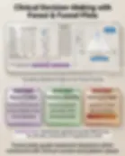
Understanding forest plots and funnel plots
Core Principle of Forest and Funnel Plots
🧷
Forest plots and funnel plots are essential meta-analysis visualization tools that synthesize evidence from multiple studies to answer clinical questions.
🧷
Forest plots display individual study results and their combined effect estimate, showing both the magnitude and precision of treatment effects across trials.
🧷
Funnel plots assess publication bias by plotting study precision against effect size — symmetry suggests unbiased literature, asymmetry suggests missing studies.
🧷
These plots transform raw numerical data into visual patterns that reveal the strength, consistency, and potential biases in medical evidence.
🧷
Board pearl: Forest plots answer "what is the overall effect?" while funnel plots answer "is the evidence biased?

Anatomy of a Forest Plot
📍
Each horizontal line represents one study, with the line length showing the 95% confidence interval — longer lines indicate less precise estimates.
📍
The central square or circle on each line represents the point estimate, with size proportional to the study's weight in the meta-analysis.
📍
The vertical line at 1.0 (for ratios) or 0 (for differences) represents the null hypothesis — no effect.
📍
The diamond at the bottom shows the pooled estimate from all studies combined, with its width representing the 95% CI.
📍
Studies are typically ordered by year, sample size, or effect magnitude to reveal patterns.
📍
Board pearl: If a confidence interval crosses the null line, that individual study shows no statistically significant effect.

Interpreting Forest Plot Results
🔹
For ratio measures (RR, OR, HR): values <1 indicate reduced risk/odds, >1 indicates increased risk/odds.
🔹
For difference measures (mean difference, risk difference): negative values indicate reduction, positive values indicate increase.
🔹
Statistical significance is determined by whether the confidence interval excludes the null value.
🔹
The I² statistic quantifies heterogeneity: 0-25% (low), 25-50% (moderate), >50% (high heterogeneity).
🔹
Weight percentages show each study's contribution to the pooled estimate, typically based on inverse variance.
🔹
Board clue: A forest plot showing all studies on one side of null with non-overlapping CIs indicates consistent, homogeneous evidence.

Forest Plot Heterogeneity Assessment
⭐
Heterogeneity refers to variability in study results beyond what would be expected by chance alone.
⭐
Visual inspection: studies with non-overlapping confidence intervals suggest heterogeneity.
⭐
Statistical tests: Cochran's Q test (p<0.10 suggests heterogeneity) and I² statistic (percentage of variance due to heterogeneity).
⭐
Clinical heterogeneity arises from differences in populations, interventions, or outcomes; statistical heterogeneity from methodological variations.
⭐
High heterogeneity (I²>50%) suggests caution in pooling results — consider subgroup analysis or random-effects models.
⭐
Board distinction: Fixed-effects models assume one true effect; random-effects models assume a distribution of true effects.

Anatomy of a Funnel Plot
✅
The x-axis displays the effect estimate (OR, RR, mean difference) from each study.
✅
The y-axis shows study precision, typically measured as standard error (inverted scale) or sample size.
✅
Each dot represents one study — larger, more precise studies appear at the top, smaller studies at the bottom.
✅
The vertical line represents the pooled effect estimate from the meta-analysis.
✅
Diagonal lines form the "funnel" shape, representing 95% confidence limits around the pooled estimate.
✅
Board pearl: In an unbiased meta-analysis, studies should scatter symmetrically within the funnel, forming an inverted triangle.

Interpreting Funnel Plot Asymmetry
🧠
Publication bias: small negative studies are less likely to be published, creating a gap in the bottom left of the plot.
🧠
Small study effects: small studies may show exaggerated treatment effects due to lower methodological quality.
🧠
True heterogeneity: genuine differences in effect sizes across populations can create asymmetry.
🧠
Selective outcome reporting: studies may preferentially report positive outcomes, distorting the funnel.
🧠
Board clue: Classic publication bias shows missing studies in the bottom left quadrant (small studies with null/negative results).
🧠
Statistical tests like Egger's test can formally assess asymmetry, but visual inspection is often sufficient.

Common Forest Plot Patterns
⚡
All studies on one side of null → consistent evidence of benefit or harm.
⚡
Studies scattered on both sides → inconsistent evidence requiring investigation of heterogeneity sources.
⚡
One outlier study with opposite effect → examine that study's methodology or population for explanations.
⚡
Increasing effect size over time → possible "decline effect" or improvements in study quality.
⚡
Subgroup analyses showing different effects → evidence for effect modification by patient or study characteristics.
⚡
Board pearl: Wide confidence intervals that include clinically important benefits AND harms indicate insufficient evidence.

Reading Forest Plot Study Weights
📌
Weight reflects each study's contribution to the pooled estimate, shown as percentage or relative square size.
📌
Calculated as the inverse of variance: studies with smaller standard errors receive greater weight.
📌
Large sample sizes and homogeneous populations increase precision and therefore weight.
📌
A single study contributing >50% weight may unduly influence conclusions — consider sensitivity analysis.
📌
Random-effects models redistribute weight more evenly compared to fixed-effects models.
📌
Board distinction: In fixed-effects models, weight = 1/variance; in random-effects, weight = 1/(variance + between-study variance).

Funnel Plot Applications Beyond Publication Bias
📣
Dose-response relationships: funnel plots can display effect sizes at different exposure levels.
📣
Quality assessment: color-coding dots by study quality can reveal if lower-quality studies show different effects.
📣
Time trends: animation or color gradients can show how evidence accumulated over time.
📣
Intervention comparison: separate funnels for different treatments can reveal comparative publication patterns.
📣
Diagnostic test accuracy: funnel plots can assess bias in sensitivity/specificity estimates across studies.
📣
Board pearl: Funnel plot asymmetry doesn't prove publication bias — it indicates the need for further investigation.

Statistical Measures in Forest Plots
🔸
P-value for overall effect tests whether the pooled estimate differs significantly from null.
🔸
P-value for heterogeneity (Q statistic) tests whether study results vary more than expected by chance.
🔸
I² quantifies the percentage of total variation across studies due to heterogeneity rather than chance.
🔸
Tau² estimates between-study variance in random-effects models.
🔸
Z-score indicates how many standard deviations the pooled effect is from null.
🔸
Board clue: P<0.05 for overall effect with I²>50% means significant effect but questionable pooling due to heterogeneity.

Subgroup Analysis in Forest Plots
🧷
Subgroups are visually separated by gaps or labels, each with its own subtotal diamond.
🧷
Tests for subgroup differences assess whether treatment effects vary significantly between groups.
🧷
Common subgroups: age, sex, disease severity, study quality, geographic region, intervention dose.
🧷
Interaction p-values <0.05 suggest true differences between subgroups (effect modification).
🧷
Multiple subgroup analyses increase false-positive risk — prespecified subgroups are more credible.
🧷
Board pearl: A treatment working in one subgroup but not another suggests effect modification, not generalizability issues.

Sensitivity Analysis Visualization
📍
Leave-one-out analysis: forest plots showing pooled estimates with each study sequentially removed.
📍
Cumulative meta-analysis: forest plots showing how pooled estimates evolved as studies were added chronologically.
📍
Influence diagnostics: plots showing each study's impact on the overall result.
📍
Trim-and-fill analysis: funnel plots with imputed "missing" studies to correct for publication bias.
📍
Quality-stratified analysis: separate forest plots for high vs. low-quality studies.
📍
Board distinction: Robust results remain similar across sensitivity analyses; fragile results change substantially.

Common Misinterpretations to Avoid
🔹
Overlapping confidence intervals don't necessarily mean non-significant differences between studies.
🔹
Statistical significance (CI excluding null) doesn't equal clinical importance — consider the magnitude.
🔹
Absence of heterogeneity (I²=0) doesn't mean studies are identical — just that variation is within chance.
🔹
Publication bias can exist even with a symmetric funnel plot if bias affects all study sizes equally.
🔹
Weight in meta-analysis doesn't reflect study quality — only precision.
🔹
Board pearl: A statistically significant pooled effect with high heterogeneity requires careful interpretation of sources of variability.

Forest Plots for Different Outcome Types
⭐
Binary outcomes: use risk ratios, odds ratios, or risk differences with log scale for ratios.
⭐
Continuous outcomes: use mean differences or standardized mean differences (Cohen's d).
⭐
Time-to-event outcomes: use hazard ratios from survival analyses.
⭐
Diagnostic accuracy: use sensitivity, specificity, or diagnostic odds ratios.
⭐
Network meta-analysis: modified forest plots comparing multiple interventions simultaneously.
⭐
Board clue: The scale (linear vs. log) affects visual interpretation — log scales make ratios appear symmetric around 1.

Quality Assessment Integration
✅
Risk of bias indicators: symbols or colors next to study names indicating quality domains.
✅
GRADE certainty: overall quality of evidence rating displayed with the pooled estimate.
✅
Sensitivity to bias: forest plots restricted to low risk-of-bias studies.
✅
Funding source annotation: identifying industry vs. non-industry sponsored studies.
✅
Study design stratification: separate pooling for RCTs vs. observational studies.
✅
Board pearl: High-quality individual studies can still yield low-certainty evidence if results are inconsistent or imprecise.

Advanced Funnel Plot Techniques
🧠
Contour-enhanced funnel plots: shaded regions showing areas of statistical significance.
🧠
Regression-based methods: Egger's or Peters' tests providing p-values for asymmetry.
🧠
Trim-and-fill: statistical imputation of "missing" studies to adjust pooled estimates.
🧠
Multiple testing adjustment: accounting for selective reporting of multiple outcomes.
🧠
Small-study effects exploration: comparing fixed vs. random effects estimates.
🧠
Board distinction: Contour-enhanced plots help distinguish publication bias from other causes of asymmetry.

Clinical Decision-Making Using These Plots
⚡
Forest plots quantify treatment effects but require clinical context for interpretation.
⚡
Consider absolute risk reduction and number needed to treat alongside relative measures.
⚡
Assess applicability: do the studied populations match your patient?
⚡
Evaluate consistency: do benefits appear across different settings and subgroups?
⚡
Balance benefits against harms, costs, and patient values.
⚡
Board pearl: A statistically significant pooled effect may still be clinically unimportant if the magnitude is small.
Red Flags in Plot Interpretation
📌
Single dominant study contributing >70% weight → conclusion depends on one trial.
📌
Asymmetric funnel with gap in bottom left → likely publication bias underestimating null results.
📌
Extreme heterogeneity (I²>75%) → pooling may be inappropriate.
📌
Subgroup effects discovered post-hoc → high risk of false-positive findings.
📌
Industry-funded studies clustering on one side → potential sponsorship bias.
📌
Board clue: Question stems highlighting these red flags usually ask about interpretation limitations, not the numerical result.

Board Question Stem Patterns
📣
Forest plot with all CIs crossing 1.0 → no individual study shows significant effect.
📣
Funnel plot with missing bottom-left studies → publication bias favoring positive results.
📣
I²=85% with disparate study results → high heterogeneity, investigate sources before pooling.
📣
Diamond CI excluding 1.0 but very wide → statistically significant but imprecise estimate.
📣
Subgroup p-interaction <0.05 → treatment effect differs between patient groups.
📣
Leave-one-out sensitivity showing changed conclusion → result dependent on single study.
📣
Asymmetric funnel with small-study effects → consider study quality differences.

One-Line Recap
🔸
Forest plots visualize individual study effects and their weighted combination to show overall treatment impact and heterogeneity, while funnel plots reveal publication bias through asymmetric scatter of study precision versus effect size, together providing essential tools for evidence synthesis and critical appraisal in evidence-based medicine.

bottom of page