top of page

eduo
visual

Biostatistics & Epidemiology
ROC curves and AUC interpretation
Core Principle of ROC Curves
🧷
ROC (Receiver Operating Characteristic) curves graphically display the performance of a diagnostic test across all possible cutoff values by plotting sensitivity (true positive rate) against 1-specificity (false positive rate).
🧷
The curve demonstrates the fundamental trade-off: as you increase sensitivity by lowering the threshold, you inevitably decrease specificity.
🧷
ROC analysis allows comparison of different tests and optimization of cutoff values based on clinical priorities.
🧷
The area under the curve (AUC) provides a single numeric summary of overall test performance across all thresholds.
🧷
Board pearl: ROC curves are the gold standard for evaluating and comparing diagnostic test performance.

Understanding the Axes
📍
Y-axis: Sensitivity (true positive rate) = TP/(TP+FN) — the proportion of diseased patients correctly identified.
📍
X-axis: 1-Specificity (false positive rate) = FP/(FP+TN) — the proportion of healthy patients incorrectly labeled as diseased.
📍
Each point on the curve represents the sensitivity and 1-specificity at a specific cutoff value.
📍
Moving up the curve (northwest) corresponds to lowering the threshold → more patients test positive → higher sensitivity but lower specificity.
📍
Moving down the curve (southeast) corresponds to raising the threshold → fewer patients test positive → lower sensitivity but higher specificity.

The Diagonal Line and Random Chance
🔹
The diagonal line from (0,0) to (1,1) represents a test with no discriminatory ability — equivalent to flipping a coin.
🔹
At any point on this line, the true positive rate equals the false positive rate, meaning the test provides no useful information.
🔹
A curve that falls below the diagonal indicates a test performing worse than random chance — though inverting the test results would make it useful.
🔹
The further the ROC curve deviates above the diagonal, the better the test's ability to discriminate between diseased and healthy individuals.
🔹
Board pearl: Any test with an ROC curve on the diagonal has an AUC of 0.5.

Area Under the Curve (AUC) Interpretation
⭐
AUC quantifies the overall discriminatory ability of a test as a single number between 0 and 1.
⭐
AUC = 0.5: No discrimination (random chance)
⭐
AUC = 0.5–0.7: Poor discrimination
⭐
AUC = 0.7–0.8: Acceptable discrimination
⭐
AUC = 0.8–0.9: Excellent discrimination
⭐
AUC = 0.9–1.0: Outstanding discrimination
⭐
AUC = 1.0: Perfect discrimination
⭐
Board pearl: AUC represents the probability that the test will rank a randomly chosen diseased patient higher than a randomly chosen healthy patient.

The Perfect Test and Real-World Tests
✅
A perfect test has an ROC curve that passes through the upper left corner (0,1), achieving 100% sensitivity and 100% specificity simultaneously.
✅
This creates a right angle with AUC = 1.0, meaning the test perfectly separates diseased from healthy with no overlap in test values.
✅
Real-world tests have curved ROC lines reflecting the inevitable trade-off between sensitivity and specificity.
✅
The closer the curve approaches the upper left corner, the better the test performance.
✅
The optimal cutoff point depends on the clinical context and the relative costs of false positives versus false negatives.

Choosing Optimal Cutoff Points
🧠
The "optimal" cutoff depends on clinical priorities, not just mathematical considerations.
🧠
Youden's index (sensitivity + specificity - 1) identifies the point maximizing the sum of sensitivity and specificity — the point furthest from the diagonal.
🧠
For screening tests where missing disease is catastrophic, choose a cutoff prioritizing sensitivity (upper right portion of curve).
🧠
For confirmatory tests where false positives carry high cost, choose a cutoff prioritizing specificity (lower left portion of curve).
🧠
Board pearl: The optimal cutoff is context-dependent — there is no universally "best" point on an ROC curve.

Comparing Multiple Tests Using ROC Curves
⚡
When ROC curves for different tests are plotted on the same graph, the test with the curve closest to the upper left corner performs best.
⚡
If curves cross, one test may be superior at high sensitivity while another excels at high specificity.
⚡
The test with the larger AUC has better overall discriminatory ability across all possible thresholds.
⚡
Statistical tests can determine if the difference in AUC between two tests is significant.
⚡
Board pearl: When comparing tests, always consider both the AUC and the specific operating point relevant to your clinical needs.

Likelihood Ratios and ROC Curves
📌
Each point on an ROC curve corresponds to a specific positive likelihood ratio: LR+ = sensitivity/(1-specificity).
📌
The slope of the tangent line at any point on the ROC curve equals the likelihood ratio at that cutoff.
📌
Steeper slopes (upper left region) indicate higher likelihood ratios and better test performance.
📌
Points near the diagonal have LR+ close to 1, providing minimal diagnostic information.
📌
Board pearl: The ROC curve visually represents how likelihood ratios change across different cutoffs.

Partial AUC and Clinical Relevance
📣
Sometimes only a portion of the ROC curve is clinically relevant — for instance, only cutoffs achieving >90% sensitivity for a screening test.
📣
Partial AUC calculates the area under only the clinically relevant portion of the curve.
📣
This approach acknowledges that extreme portions of the curve may represent impractical operating points.
📣
Standardized partial AUC allows comparison between tests focused on specific performance ranges.
📣
Board pearl: A test with lower overall AUC might still be superior in the clinically relevant range.

ROC Analysis for Continuous Variables
🔸
ROC curves are particularly useful for tests producing continuous results (e.g., biomarker levels, risk scores).
🔸
Every possible cutoff value generates a unique sensitivity-specificity pair, creating a smooth curve.
🔸
The curve visualizes how test performance changes as the threshold moves across the range of possible values.
🔸
This allows optimization of cutoffs based on population characteristics and clinical goals.
🔸
Board pearl: ROC analysis transforms a continuous test into a binary classifier at any chosen threshold.

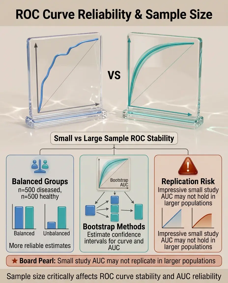
Sample Size and ROC Curve Reliability
🧷
Small samples produce jagged, unstable ROC curves with wide confidence intervals around the AUC.
🧷
Larger samples yield smoother curves and more precise AUC estimates.
🧷
The ratio of diseased to healthy subjects affects curve stability — balanced groups generally produce more reliable estimates.
🧷
Bootstrap methods can estimate confidence intervals for both the curve and AUC.
🧷
Board pearl: An impressive AUC from a small study may not replicate in larger populations.
Disease Prevalence and ROC Curves
📍
ROC curves and AUC are independent of disease prevalence — they depend only on the test's ability to discriminate.
📍
This makes ROC analysis useful for comparing tests across populations with different disease prevalences.
📍
However, predictive values (which matter clinically) do depend on prevalence and cannot be read from ROC curves.
📍
The same ROC curve yields different predictive values in screening (low prevalence) versus diagnostic (high prevalence) settings.
📍
Board pearl: ROC curves show test discrimination, not clinical utility in specific populations.

Multi-category ROC Analysis
🔹
Traditional ROC curves handle binary outcomes, but extensions exist for ordinal outcomes (mild/moderate/severe disease).
🔹
Multi-category ROC analysis uses multiple curves or volume under the ROC surface (VUS).
🔹
Each curve represents discrimination between one category and all others, or between adjacent categories.
🔹
This approach is valuable for staging systems and severity scores.
🔹
Board pearl: Board questions typically focus on binary ROC curves unless specifically addressing disease staging.

Combining Multiple Tests
⭐
ROC curves can evaluate combinations of tests using logistic regression or other models.
⭐
The combined test ROC curve should lie above individual test curves if the combination adds value.
⭐
Parallel testing (positive if either test positive) increases sensitivity; series testing (positive only if both positive) increases specificity.
⭐
Mathematical models can determine optimal weighting of multiple test results.
⭐
Board pearl: Combining tests works best when they measure different aspects of disease (orthogonal information).

Common Pitfalls in ROC Interpretation
✅
Spectrum bias: ROC curves derived from obviously diseased vs. obviously healthy subjects overestimate real-world performance.
✅
Verification bias: Only testing positive screening results underestimates false positive rates.
✅
Different ROC curves may apply to different subpopulations (age, sex, comorbidities).
✅
Optimizing cutoffs on the same data used to generate the curve leads to optimistic performance estimates.
✅
Board pearl: Always consider how the study population compares to your intended use population.

ROC Curves in Screening Programs
🧠
Screening tests typically operate at high-sensitivity cutoffs (upper right of ROC curve) to minimize missed cases.
🧠
The false positive rate at this operating point determines the burden of follow-up testing.
🧠
Multi-stage screening uses high-sensitivity first tests followed by high-specificity confirmatory tests.
🧠
ROC analysis helps balance detection rates against resource utilization.
🧠
Board pearl: Effective screening requires not just good test performance but also accessible follow-up for positive results.

Statistical Significance and Clinical Importance
⚡
Two tests may have statistically different AUCs but clinically equivalent performance.
⚡
Confidence intervals for AUC indicate precision of the estimate — narrow intervals suggest reliable results.
⚡
The minimum clinically important difference in AUC depends on disease severity and intervention consequences.
⚡
Cost-effectiveness analysis may favor a cheaper test with slightly lower AUC.
⚡
Board pearl: Statistical superiority does not automatically translate to clinical adoption.

ROC Curves for Risk Prediction Models
📌
Clinical prediction rules and risk scores are evaluated using ROC curves by treating predicted probability as a continuous test result.
📌
Well-calibrated models have predicted probabilities that match observed outcome rates.
📌
Discrimination (AUC) and calibration are separate properties — a model can rank patients well but assign incorrect absolute risks.
📌
Adding predictors should increase AUC if they provide independent information.
📌
Board pearl: Modern cardiovascular risk calculators typically achieve AUC of 0.75–0.80.

Board Question Stem Patterns
📣
Graph showing sensitivity vs. 1-specificity → identify as ROC curve and interpret position relative to diagonal.
📣
Test A has curve above Test B throughout → Test A superior at all operating points.
📣
Asked to choose screening test cutoff → select point prioritizing sensitivity (upper right region).
📣
AUC = 0.92 for cancer biomarker → excellent discrimination, but still need to consider prevalence for predictive values.
📣
ROC curves cross → tests have different strengths; choice depends on clinical priority.
📣
Adding new biomarker increases AUC from 0.72 to 0.75 → modest but potentially meaningful improvement.

One-Line Recap
🔸
ROC curves plot sensitivity versus 1-specificity across all cutoffs, with the AUC summarizing overall test discrimination (0.5 = chance, 1.0 = perfect), enabling optimal cutoff selection based on clinical context and valid comparison of diagnostic tests independent of disease prevalence.

bottom of page